
Links and buttons are not the same. They are not actionable in the same ways. They do not do the same things when they are activated. It follows, then, that they should not look the same. Yet when you start to look for it you see it everywhere, especially in web apps. This is a problem that can be fixed, but first let us look at four types of buttons and links to understand why they are different.
Form submission
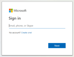
This is a button that submits form values to a form-handler. You will see it when logging into an account, adding items to a virtual shopping cart, and generally anywhere a site takes user data and passes it to a server to do whatever servers do with user data. In the example in Figure 1, the “Next” button submits your email, phone number or Skype handle to the Microsoft server, and if it’s a valid account you’ll be asked for a password.
Type = button
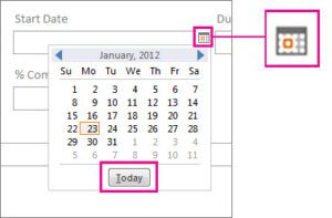
Buttons that are not submit buttons are used to create user experiences that rely on JavaScript, such as revealing content that is hidden until the button is activated. Most buttons that are used to create custom actions are buttons of this type. In the example of Figure 2, activating the calendar button reveals a date picker, which in and of itself is riddled with even more buttons of this type. The button is pressed and an action or change of some kind takes place.
Hyperlinks
Hyperlinks, or more commonly just “links”, let users navigate to a different page within the website, a different section within the same page they’re browsing, or to a different URL or file entirely. They can open in the same page or in a new page. Links are useful because we can’t be bothered to learn every single URL on the web, and they enable us to not have to.

Call to action (CTA)
A call to action is basically an invitation for a user to take some action that the site owner wishes they would take. CTAs look like buttons, but there is no specific “call to action” element. They are often just hyperlinks made to look like buttons so they stand out from the rest of the links on the page or site, and the user perceives them to be more important than other links. That’s how site owners get visitors to “LEARN MORE” about their product, or “SIGN UP NOW” for their service.
So, what’s the problem?
Calls to action are links, but they look like buttons, and that can obscure their behavior, but styling them to look like links diminishes how much importance the user affords them, which is counter-productive to why we want to use a call to action in the first place. In some cases, it even makes sense to place links next to buttons within a UI, and it is desirable to make them look the same for consistency. Consistency is a hallmark of good design, after all. However, as UI designer Adam Silver said on his blog, titled Simple = Human, “consistency is not about making different things the same. It’s about making the same things the same.”
The problem is that when a link looks like a button it is dishonest. It says “buttons and links are the same” when they are not. One of the key functional differences between a button and a link is that a button generally should not move the user’s focus (though form submit buttons often do, and that’s fine because it’s expected) and a link’s purpose is navigating, so not moving the user’s focus when it’s activated would be unusual. There are also different ways to activate a button than a link. A button is invoked by pressing enter/return or space bar, but a hyperlink can only be invoked by pressing enter/return. Additionally, users can right click a link for a variety of options unique to following links, such as open it in new tab or window, copy the URL, or bookmark the destination URL. Users cannot do any of those things with a button.
The Web Content Accessibility Guidelines (WCAG) has well-defined rules for how to identify links; 1.4.1 “Use of Color” says color should not be the only means of identifying a link, 2.4.4 “Link Purpose (In Context)” says the link text alone, or if that isn’t possible the text of the paragraph or sentence that contains the link, should identify its purpose. This really isn’t a question of how to identify your CTAs as links, but how to differentiate your CTAs from your buttons. A call to action needs to stand out, but it also needs to look different than buttons do. There is simply no written-in-stone guidance for how to do this, but reference the example in Figure 5. In this example, the top image is a call to action that looks exactly like a button. Meanwhile, the bottom image is an example of how to make that same call to action stand out from buttons on the page without diminishing its weight.
If users knew they could open a call to action in a new window, would they do that? I might, and possibly others might not, but that is not the point. The point is that the user should be given that choice, and that right there, choice, is the core foundation of inclusive design. This is a small detail and a small problem in isolation, but small problems add up quickly to degrade the inclusiveness of the experience.
Some might even say it’s a grey area because form buttons and links both navigate the user away from their location, but I say it’s about the interaction, not the destination. Just because the destination is the same does not mean the interaction is also the same. Semantics exist for a reason, why would we design the meaning out of a control for aesthetics?
Summary
As a tester, I find a lot of problems-it’s kind of my job-and I am privy to the process of fixing those problems. I get frustrated with wasting time writing bugs and fixing things that should not have been broken initially. This is a minor issue, but it is something we can fix before it becomes one. Create your calls to action as call to actions, make them dominate the page and demand attention, but make them honest about what they are.
Want more information?
If you would like to learn more information, please contact us today.