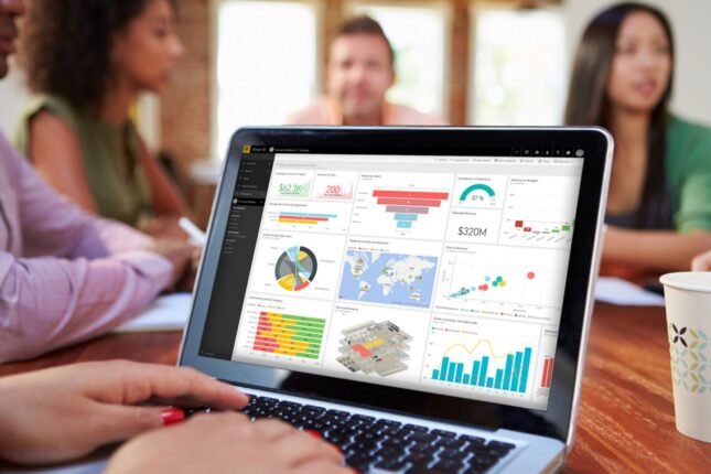
• Skip to primary navigation
  • Skip to main content
  • Skip to footer
  • Who we are
    • Our values
    • Our story
    • Our clients
    • Our world presence
    • Locations
  • What we do
    • Solutions
    • Content services platforms  ▸ 
      • What is CSP?
      • Solution Enablement Toolkit (SET)
      • Nuxeo systems integrator
      • Meet our Nuxeo developers
      • Content Services Platforms resources
    • Robotic process automation  ▸ 
      • What is RPA
      • Solution Enablement Toolkit
      • Automation center of excellence
      • Journey to intelligent automation
    • Collaboration software
    • Services
    • Accessibility compliance  ▸ 
      • Accessibility development & design
      • Accessibility testing
      • Accessibility training & learning
      • Accessibility file & document remediation
      • Accessibility resources
    • Cloud & application development
    • Data & analytics
    • Support services
  • How we do it
    • Getting started
    • Governance model
    • Project management office
    • QA Framework
    • Insights
    • Case studies
    • Events & community
  • Join us
iSoftStone

iSoftStone

A step above: We help you reach the next level in digital transformation

  • Who we are
    • Our values
    • Our story
    • Our clients
    • Our world presence
    • Locations
  • What we do
    • Solutions
    • Content services platforms  ▸ 
      • What is CSP?
      • Solution Enablement Toolkit (SET)
      • Nuxeo systems integrator
      • Meet our Nuxeo developers
      • Content Services Platforms resources
    • Robotic process automation  ▸ 
      • What is RPA
      • Solution Enablement Toolkit
      • Automation center of excellence
      • Journey to intelligent automation
    • Collaboration software
    • Services
    • Accessibility compliance  ▸ 
      • Accessibility development & design
      • Accessibility testing
      • Accessibility training & learning
      • Accessibility file & document remediation
      • Accessibility resources
    • Cloud & application development
    • Data & analytics
    • Support services
  • How we do it
    • Getting started
    • Governance model
    • Project management office
    • QA Framework
    • Insights
    • Case studies
    • Events & community
  • Join us

7 things you can do to make your Power BI dashboards more accessibly compliant

Get tips on creating an accessibly compliant Power BI dashboard.

Home ‣ Insights ‣ Knowledge Leader ‣ 7 things you can do to make your Power BI dashboards more accessibly compliant

July 29, 2020 by John Baron

When I've talked to other people about accessibility compliance and digital content, usually the conversation goes to web sites and applications. Sometimes people will bring up Office apps, and very rarely PDFs are mentioned. Something that just never seems to enter the conversation are reporting dashboards. I'm not sure why since more and more people are using dashboards to present and display data up their leadership chains. But just like other digital content, people with disabilities use different assistive technology to consume content presented on dashboards.

Believe me, I realize some of the challenges that come up with platforms used to create and publish dashboards. It does seem there's more help and guidance around compliance for sites and apps. But that doesn't mean we should give up trying, right? If we're concerned with making content accessible for all users, then digital dashboards should be something we want to get as right as possible too. So take a look below at the seven tips you can follow to help make your Power BI dashboards (or any other dashboard) accessibly compliant.


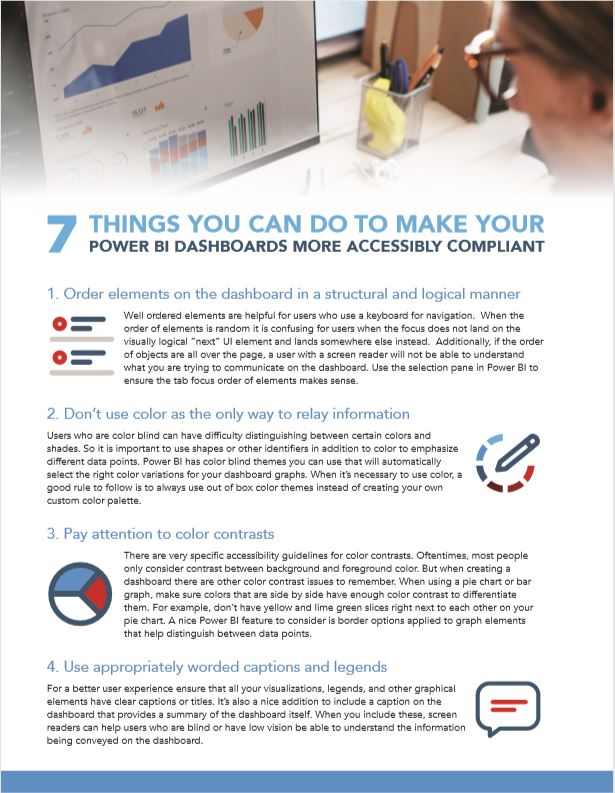
1. Order elements on the dashboard in a structural and logical manner

Well ordered elements are helpful for users who use a keyboard for navigation. When the order of elements is random it is confusing for users when the focus does not land on the visually logical “next” UI element and lands somewhere else instead. Additionally, if the order of objects are all over the page, a user with a screen reader will not be able to understand what you are trying to communicate on the dashboard. Use the selection pane in Power BI to ensure the tab focus order of elements makes sense.


2. Don’t use color as the only way to relay information

Users who are color blind can have difficulty distinguishing between certain colors and shades. So it is important to use shapes or other identifiers in addition to color to emphasize different data points. Power BI has color blind themes you can use that will automatically select the right color variations for your dashboard graphs. When it’s necessary to use color, a good rule to follow is to always use out of box color themes instead of creating your own custom color palette.


3. Pay attention to color contrasts

There are very specific accessibility guidelines for color contrasts. Oftentimes, most people only consider contrast between background and foreground color. But when creating a dashboard there are other color contrast issues to remember. When using a pie chart or bar graph, make sure colors that are side by side have enough color contrast to differentiate them. For example, don’t have yellow and lime green slices right next to each other on your pie chart. A nice Power BI feature to consider is border options applied to graph elements that help distinguish between data points.


4. Use appropriately worded captions and legends

For a better user experience ensure that all your visualizations, legends, and other graphical elements have clear captions or titles. It’s also a nice addition to include a caption on the dashboard that provides a summary of the dashboard itself. When you include these, screen readers can help users who are blind or have low vision be able to understand the information being conveyed on the dashboard.


5. Consider line graphs over other graph styles

Having several different graph styles can clutter a dashboard and obscure the message you’re trying to convey. Line graphs are simplistic and display complex data easily. They help eliminate cluttered visuals, and lines can be customized to differentiate between various data points through line weight and different line patterns.


6. Use filters to help reduce complex or cluttered visuals

Creating clean and easy-to-read dashboards is part of inclusive design that supports all users. Your visualizations should be summary views of the critical information you want to convey aggregated to make it easier to consume and understand. Rather than adding too many data points in a single visualization, allow the user to control different snapshots with filters and slicers.


7. Always promote access to the underlying data

An important guiding principle when creating dashboards is this: people are there for the data, not the visual. Graphs provide a wonderful means to quickly portray a snapshot of activity, but for users who are blind or have low vision, the data is much more important. Screen readers can provide more value to their users when navigating through data than captions, legends, or alt-text can provide. So be aware of Power BI features like Export to CSV and Show Visuals as a Table that support people using screen readers to consume your information.


Additional Information

Below are some links you may find helpful as you continue to build dashboards while keeping accessibility in mind.

Web Content Accessibility Guidelines

  • Make all functionality accessible from a keyboard
    https://www.w3.org/TR/WCAG21/#keyboard-accessible
  • Make pages operate in predictable ways
    https://www.w3.org/TR/WCAG21/#predictable
  • Make it easier for users to hear and see content
    https://www.w3.org/TR/WCAG21/#distinguishable
  • Provide text alternatives for no-text content
    https://www.w3.org/TR/WCAG21/#text-alternatives

Power BI and Accessibility

  • Overview of accessibility in Power BI
    https://docs.microsoft.com/en-us/power-bi/create-reports/desktop-accessibility-overview
  • Design Power BI reports for accessibility
    https://docs.microsoft.com/en-us/power-bi/create-reports/desktop-accessibility-overview
  • Creating reports in Power BI using accessibility tools
    https://docs.microsoft.com/en-us/power-bi/create-reports/desktop-accessibility-creating-tools

Feel free to download a PDF version of this content and keep it nearby to use as a handy reference when building your next Power BI dashboard. Or share it with someone you know that could benefit from the content I've shared.

Hopefully you found this helpful. If you did, drop us a line at iSoftStone and let us know.

John Baron profile picture by John Baron Account Director | Accessibility Practice
Reading Time:
5 minutes
Share:
Special thanks to Evgenia (Jenia) Walker and Robert Troxel for editorial and content review on this post.
First page of the file, "7 things you can do to make your Power BI dashboards more accessibly compliant."
 

Knowledge Leader accessibility

Footer

Get in touch

  • info@isoftstone.com
  • +1 425-216-6300
CONTACT US

iSoftStone

  • North America Headquarters
    5808 Lake Washington Blvd. #201
    Kirkland, WA 98033
    USA


    New York
    777 Westchester Avenue, Suite 101
    White Plains, NY 10604
    USA

Our other channels

Twitter LinkedIn Instagram YouTube Channel

Navigation

Who we are
  • Our values
  • Our story
  • Our clients
  • Our world presence
  • Locations
What we do
  • Content services platform
  • Robotic process automation
  • Collaboration software
  • Accessibility compliance
  • Cloud & application development
  • Data & analytics
  • Support services
How we do it
  • Getting started
  • Governance model
  • Project management office
  • QA framework
  • Insights
  • Case studies
  • Events & community
Join us
Privacy

Copyright © 2005–2021 iSoftStone, Inc. All rights reserved.

We are using cookies to give you the best experience on our website.

You can find out more about which cookies we are using or switch them off in settings.

Privacy Overview
iSoftStone

This website uses cookies so that we can provide you with the best user experience possible. Cookie information is stored in your browser and performs functions such as recognizing you when you return to our website and helping our team to understand which sections of the website you find most interesting and useful.

Strictly Necessary Cookies

Strictly necessary cookies should be enabled at all times so that we can save your preferences for cookie settings.

If you disable this cookie, we will not be able to save your preferences. This means that every time you visit this website you will need to enable or disable cookies again.

Google Analytics

This website uses Google Analytics to collect anonymous information such as the number of visitors to the site and the most popular pages. Keeping this cookie enabled helps us improve our website.

Please enable strictly necessary cookies first so that we can save your preferences!

Cookie Policy

More information about our Privacy and Cookie Policy.

Powered by  GDPR Cookie Compliance