
Designers select colors based on a variety of factors when creating a website or application. Most organizations want to maintain a consistent style and have predefined brand colors they must use. Colors can evoke feelings, and they can influence your actions as well. Barney purple wouldn’t be your first proposal for a FinTech website. Finance and technology companies typically use blues because it means trust, strength, and dependability instead of purple, which symbolizes magic, mourning, and mystery. So much time and research is put into choosing those precise colors, but what about users who cannot distinguish color? What is the visual experience like for them?
Color accessibility in web design means creating components and patterns that people who cannot differentiate the full-color spectrum can still experience the web page as intended. Color accessibility also means meeting the minimum requirements for color contrast ratios as directed by the Web Content Accessibility Guidelines (WCAG).
Types of Color Blindness
Even if a color theme meets contrast ratios for color, text, and graphical elements such as icons, it may still fail to be color blindness accessible. When creating a color-accessible website, there are three primary types of color blindness to understand: Deuteranopia, tritanopia, and protanopia.
Deuteranopia
Deuteranopia, the most common form of color blindness, is a condition where people cannot distinguish green hues.
Deuteranopes are more likely to confuse:
- Mid-reds with mid-greens
- Blue greens with gray and mid-pinks
- Bright greens with yellows
- Pale pinks with light gray/white
- Mid-reds with mid-brown
- Light blues with light purple
Protanopia
Protanopia refers to a type of color blindness in which a person cannot distinguish the red color.
Protanopes are more likely to confuse:
- Black with shades of red
- Dark brown with dark green, dark orange, dark red, dark blue/purple, and black
- Some blues with some reds, purples, and dark pinks
- Mid-greens with some oranges
Tritanopia
An individual with tritanopia color blindness cannot distinguish between blue and yellow hues, but they can still perceive shades of red and green.
Monochromacy
Monochromacy is a condition where a person cannot see colors, only black, white, and shades of gray. Monochromacy is the least common form of color blindness.
Color Blind Simulation
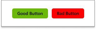
A user without color blindness can quickly determine which button is the good button and the bad button in the example below. The green “good” button has a contrast ratio of 8.49:1, and the red “good” button is 5.25:1. Technically, both buttons pass WCAG 2.1 AA color contrast conformance, but these buttons offer a substantially different experience for those with color blindness.
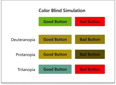
In the example above, the color simulation shows what the buttons look like to someone with deuteranopia, protanopia, and tritanopia color blindness. People with deuteranopia cannot quickly, if at all, decern the difference between the two buttons. Someone with protanopia can differentiate between the buttons, but the text inside the “bad” button may be unreadable because the color presents much darker (2.49:1 vs. 5.25:1) than intended. Individuals with tritanopia color blindness can distinguish between the green “good” button and the red “bad” button. Still, the muted green and dark red does not have the same visual appeal and color harmony as the bright green and red.
As a web designer, so much planning is put into your color choices. You want a pleasant, inclusive experience for all users. There are excellent online tools and resources to help you with your inclusive color choices.
Color Blind Safe
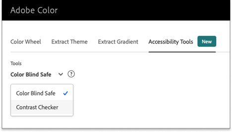
Adobe Color has a newly added Accessibility Tools tab that allows you to check against WCAG 2.1 AA and AAA color contrast success criteria. You can also check to ensure the color theme is color blind safe and if there are potential color conflicts.
Adobe Contrast Checker: https://color.adobe.com/create/color-contrast-analyzer
Adobe Color Blind Safe: https://color.adobe.com/create/color-accessibility
Conclusion
No website is flawless. However, as designers, we must develop solutions that are inclusive of all users, including people with color blindness and color vision deficiency.
iSoftStone is committed to accessibility advocacy, awareness, and evangelism. We help organizations improve their compliance across their digital content. If you found this article helpful, drop us a line at iSoftStone and let us know.
Want more information?
If you would like to learn more information, please contact us today.
References
Understanding success criterion 1.4.3: Contrast (Minimum). (n.d.). World Wide Web Consortium (W3C). https://www.w3.org/WAI/WCAG21/Understanding/contrast-minimum.html
Types of colour blindness. (2022). Colour Blind Awareness. https://www.colourblindawareness.org/colour-blindness/types-of-colour-blindness/
Color blindness accessibility. (2021, October 18). Siteimprove.
https://www.siteimprove.com/blog/color-blindness-accessibility
How the color blue impacts moods, feelings, and behaviors. (n.d.). Verywell Mind. https://www.verywellmind.com/the-color-psychology-of-blue-2795815