
The PDF is a staple of digital documentation, but they also have the potential to be one of the least accessible types of document files. In this article you will find some steps to help you create an accessible PDF by creating a document file in Microsoft Word.
Document title
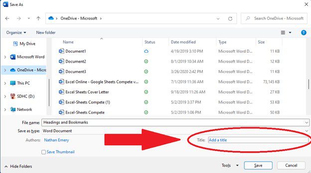
The most often overlooked step is to create a document title. No special instructions are required to do this, it can be done when you save the document before exporting to PDF. In the Save As dialog, locate the Title element at the bottom right, below the “Save As Type” list box (see Figure 1). Enter the title of the document here. When the document title is missing a screen reader user will hear the file name of the document as they switch back and forth between windows using Alt + Tab, which is often not very clear when they’re trying to find their document window amongst other windows they have open.
Headings and bookmarks
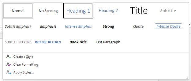
Use text styles to create a programmatic heading structure that matches the visually logical heading structure. This means that if the text is meant to look like a heading it should use a font style that matches it (see Figure 2). These styles are available in the Home tab of Microsoft Word. Proper heading styles also automatically create bookmarks. Bookmarks are required for any document in excess of 19 pages but the best practice is to bookmark any document no matter how many pages it is.
It is equally important to use the correct heading level hierarchy as it is to use correct styles. Heading levels should start with Heading 1 and be nested logically. H2 follows H1, H3 follows H2, so on and so forth. Do not skip heading levels. You can change the visual styling (font face, color, size, etc) after you apply the heading style if you do not like how the presets make your text look, but using the correct style enables screen readers to locate and navigate the document logically.
When a document doesn’t use heading levels, or uses incorrect heading levels, it makes it far more difficult for a screen reader user to locate the document body of text and consume it with clarity. It is akin to reading a book with no division of chapters and being unable to thumb through the pages to find where you left off.
Images
Images can add a lot of context and personality to an otherwise dry document, and screen reader users get as much from them as sighted users do, provided proper alternative text is supplied by the document’s author. Adding alt text to an image is easy: after inserting an image, access the Alt Text pane from the Picture Format ribbon tab, or right click the image and select “Alt Text” from the context menu (see Figure 3).
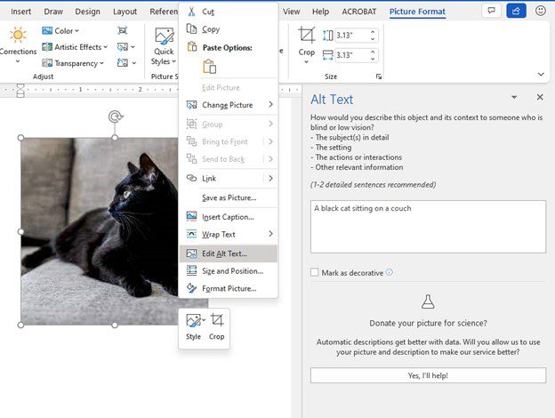
Alt text should describe the image content in as much detail as a sighted user can consume, but without being too verbose. One or two sentences is recommended. For the above picture, alt text reading “a cat” would be descriptive, but alt text reading “a cat sitting on a white couch” would be better. Avoid using phrases like “image of” or “picture of” because a screen reader will know what the object is and announce it as an image to the user by default.
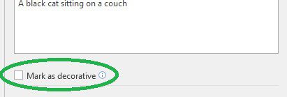
Some images do not have meaning, as they are purely decorative in function. Separator bars, icons, background images, decorative borders and the like are all just that: decorative. Using the alt text pane, these images can be marked as decorative and screen readers will ignore them (see Figure 4).
There are a few additional considerations for images in a document. First, your images should be in line with the text so as to preserve their place in the reading order. This is done via the Wrap Text tool in the Picture Layout ribbon tab in Word. Avoid using text wrapping whenever possible. Second, avoid using images of text if using actual text is an option. If an image of text is unavoidable, the alt text must contain the text exactly as it appears in the image.
Tables
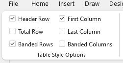
Table can be difficult to consume non-visually, so it is important to create them correctly. Tables need header rows for screen reader users to be able to understand how the data is organized. Once a table is inserted into the document, click the Table Design ribbon tab and locate the table style options (see Figure 5). Use the check boxes to denote the first row and/or the first column as header cells for the table’s data, as needed for your table’s design. Tables in Microsoft Word can handle header cells along the first row, and along the first column, but more complex tables are not possible to create. Avoid creating the appearance of a more complex table by using visual styling to emulate the appearance of headers where they do not programmatically exist.
Avoid using tables for reasons other than presenting tabular data. Do not use tables for layout purposes because it is confusing for non-visual users to hear that they have entered a table when the table’s only purpose is, for example, organizing text into columns. In HTML it is possible to remove a table’s semantics and use it for layout, but the same is not possible in Word.
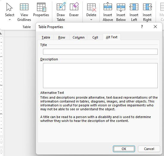
You should also avoid using any of the merge commands to merge cells, split cells or split the table. This makes it difficult to impossible for a non-visual user to consume it with any clarity. If these things are absolutely unavoidable, use the title and description attributes in the alt text tab of the table properties window, located in the Layout ribbon tab (see Figure 6). Title the table and give it a description that explains what data the table is showing in as much detail as necessary for someone to understand it without being able to see it. Unlike image alt text, a table summary can be as verbose as necessary.
Charts
Charts are extremely difficult to make accessible, and almost impossible to create in Word and export to PDF in an accessible format. The most accessible solution is simply to avoid using charts whenever possible. Use tables instead. After being exported to PDF, users lose a lot of the ability they have to drill into a chart that Word provides them. To compensate for this, you can add alt text to a chart just like you can do for an image.
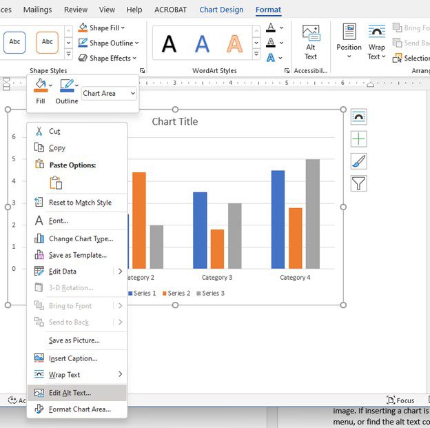
If inserting a chart is unavoidable, right click the chart and select “edit alt text” from the context menu or find the alt text control in the Layout ribbon tab (see Figure 7). Chart alt text must be as descriptive as possible of the data trends the chart is showing. Like images, charts should also be inline with the text.
By following these recommended suggestions, it doesn’t take much additional effort to ensure your PDF documents are accessibly compliant and readable by as wide an audience as possible. These small steps can make all the difference for users that rely on screen readers to consume content.
Want more information?
If you have more questions about ways to make PDFs or other digital content accessibly compliant, or if you would like to learn more about the accessibility services iSoftStone offers, please contact us and we would be happy to meet and answer your questions. Please reach out!